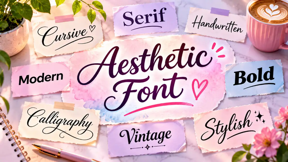
An aesthetic font transforms ordinary text into visually attractive lettering that reflects your personality, mood, or creative style. Whether you want a cute Instagram bio, an elegant TikTok display name, a minimalist caption, or a distinctive design for your website, the right lettering can make your words more memorable. Many popular styles use Unicode characters that you can copy and paste without installing a font. Others are downloadable typefaces designed for websites, presentations, logos, and creative projects. This guide explores 15 beautiful text styles, explains how to create and use them, and helps you choose the right typography for social media, personal branding, and everyday digital content.
What Is an Aesthetic Font?
An aesthetic font is a lettering style selected for its visual appeal and ability to communicate a particular mood. Unlike a standard system font, aesthetic lettering often emphasizes distinctive shapes, spacing, decorative details, or artistic character.
For example, flowing cursive letters can create a romantic impression, while clean geometric lettering feels modern and professional. Gothic lettering adds drama, and rounded bubble characters create a playful appearance.
The term generally describes two different things:
- Copy-and-paste text: Decorative Unicode characters that resemble bold, cursive, gothic, or other styled letters.
- Actual typefaces: Font files used in graphic design, websites, documents, and applications.
This distinction matters because the two work differently. Copy-and-paste lettering can appear in many text fields without changing the application’s font settings. A downloadable typeface, on the other hand, must be installed or supported by the software displaying it.
Both options are useful, but the best choice depends on where you intend to use your text.
15 Beautiful Aesthetic Font Styles to Copy and Paste
Looking for a quick way to make your text more attractive? The following examples demonstrate popular lettering styles and the visual moods they create.
You can copy the sample text directly or use the examples as inspiration when creating your own names, captions, and profile descriptions.
| Font Style | Copy-and-Paste Example | Best For |
| Elegant Cursive | 𝓓𝓻𝓮𝓪𝓶 𝓑𝓲𝓰 | Romantic bios and captions |
| Soft Script | 𝒮𝓉𝒶𝓎 𝒞𝒶𝓁𝓂 | Lifestyle content |
| Bold Serif | 𝐃𝐫𝐞𝐚𝐦 𝐁𝐢𝐠 | Short statements |
| Modern Bold | 𝗗𝗿𝗲𝗮𝗺 𝗕𝗶𝗴 | Profile highlights |
| Classic Italic | 𝐷𝑟𝑒𝑎𝑚 𝐵𝑖𝑔 | Elegant quotes |
| Gothic | 𝔇𝔯𝔢𝔞𝔪 𝔅𝔦𝔤 | Alternative fashion and gaming |
| Double-Struck | 𝔻𝕣𝕖𝕒𝕞 𝔹𝕚𝕘 | Creative display names |
| Monospace | 𝙳𝚛𝚎𝚊𝚖 𝙱𝚒𝚐 | Technology-inspired designs |
| Bubble Letters | Ⓓⓡⓔⓐⓜ Ⓑⓘⓖ | Cute profiles |
| Small Caps | ᴅʀᴇᴀᴍ ʙɪɢ | Minimalist bios |
| Fullwidth | Dream Big | Vaporwave and retro themes |
| Spaced Text | D R E A M B I G | Minimalist headings |
| Sparkle Text | ✧ Dream Big ✧ | Creative captions |
| Heart Decoration | ♡ Dream Big ♡ | Soft and romantic content |
| Moon Decoration | ☾ Dream Big ☽ | Dreamy and celestial themes |
These examples are text characters rather than images. However, some may appear differently across devices or may not be accepted in particular username fields.
Cute and Soft Lettering
Cute typography works especially well for personal journals, lifestyle accounts, beauty content, and cozy-themed profiles. Rounded letters, hearts, stars, and gentle decorative details create a friendly visual identity.
For a softer look, try combining ordinary text with one or two symbols:
♡ little moments ♡
✧ sunshine and coffee ✧
୨୧ made of daydreams ୨୧
You do not need to transform every letter. Sometimes a simple symbol surrounding readable text produces a cleaner result than an elaborate script.
Elegant and Minimalist Lettering
A minimalist style focuses on clarity, balanced spacing, and uncomplicated letter shapes. Small caps, restrained serif lettering, and carefully spaced words can create a polished appearance without excessive decoration.
This approach is particularly useful for photography accounts, portfolios, fashion pages, and personal branding.
A refined example might be:
STUDIO NOTES
Or:
✦ everyday inspiration
Both communicate a recognizable visual identity while keeping the message easy to understand.
Gothic, Vintage, and Y2K Styles
Gothic lettering features dramatic strokes and historical influences. It works well for alternative fashion, fantasy-inspired artwork, music-related content, and gaming display names.
Vintage typography often draws inspiration from older editorial designs, traditional signage, or classic printing styles. Y2K lettering, meanwhile, commonly incorporates futuristic shapes, playful symbols, and visual references to late-1990s and early-2000s digital culture.
When choosing among these styles, consider your audience. A dramatic blackletter name might suit a fantasy gaming profile, but it could be difficult to read on a professional business page.
How Does an Aesthetic Font Generator Work?
Most online text generators replace standard letters with visually similar Unicode characters. Instead of changing the typeface used by an application, they produce a new sequence of characters.
For example:
| Text Type | Example |
| Original text | Hello |
| Script-style characters | 𝓗𝓮𝓵𝓵𝓸 |
| Bold-style characters | 𝐇𝐞𝐥𝐥𝐨 |
| Fullwidth characters | Hello |
The original and converted versions may look like the same word, but they are not necessarily encoded as the same characters.
According to the Unicode Consortium’s documentation, many mathematical alphabet characters were created to represent distinct meanings in mathematical notation, not to decorate ordinary writing. Their use in social media styling is an adaptation rather than their intended purpose.
Unicode+1
That explains why decorative text can retain its appearance when pasted into another application, but may also create accessibility or compatibility problems.
How to Generate and Copy Stylish Text
Creating customized lettering usually takes just a few steps:
- Open a browser-based text generator.
- Enter your name, phrase, caption, or short biography.
- Preview the available cursive, bold, gothic, and decorative styles.
- Choose the version that matches your intended look.
- Copy the generated text.
- Paste it into your chosen application and check the final appearance.
You can experiment with a free tool such as Messletters’ Aesthetic Font Generator, which provides multiple lettering styles and decorative symbols.
Copy & Paste Aesthetic Text
Most browser-based generators do not require you to install a typeface. However, avoid entering passwords, private information, or sensitive account details into unfamiliar websites.
Font Aesthetic: Choosing the Right Typography for Your Style
A well-planned font aesthetic does more than make text look attractive. It helps establish a recognizable visual personality across your social profiles, website, marketing materials, or creative projects.
Start by identifying the feeling you want your content to communicate. A wedding invitation, for example, might benefit from flowing script lettering, while a technology blog generally needs clean, readable typography.
| Desired Appearance | Recommended Typography |
| Luxury and elegance | Refined serif fonts |
| Modern and professional | Clean sans-serif fonts |
| Romantic and personal | Script or handwritten fonts |
| Creative and playful | Rounded display fonts |
| Vintage and editorial | Classic serif fonts |
| Futuristic and technical | Geometric or monospace fonts |
| Bold and expressive | Heavy display fonts |
Consistency is equally important. Using five unrelated lettering styles across a single design can make it feel disorganized. A practical approach is to select one distinctive font for headings and another highly readable font for supporting information.
Best Free Fonts for Aesthetic Designs
If you are creating graphics, presentations, or a website, actual typefaces provide more control than Unicode substitutions. You can adjust font size, weight, spacing, and other formatting options without changing the underlying text.
Here are several attractive typefaces worth exploring:
| Typeface | Style | Recommended Use |
| Playfair Display | Elegant serif | Editorial headings and fashion websites |
| Cormorant Garamond | Refined serif | Luxury branding and invitations |
| Poppins | Geometric sans-serif | Social graphics and modern websites |
| Montserrat | Contemporary sans-serif | Branding and headlines |
| DM Sans | Clean sans-serif | Websites and everyday content |
| Great Vibes | Decorative script | Invitations and short decorative titles |
| Dancing Script | Handwritten script | Personal messages and creative graphics |
| Space Mono | Monospace | Technology and retro-inspired designs |
These typefaces are available through Google Fonts, where you can preview different families and explore their available styles. Check the applicable font license before using any downloaded typeface in a commercial project.
A useful pairing for a lifestyle website is Playfair Display for headlines and DM Sans for body text. For a technology portfolio, Space Mono can add personality to short headings while Poppins keeps longer explanations readable.
Tulisan Aesthetic: Creating Beautiful Decorative Writing
The phrase tulisan aesthetic combines Indonesian and English terminology and broadly refers to aesthetically pleasing writing or decorative text. People searching for it often want attractive lettering for social media bios, names, captions, or personal messages.
The appeal comes from making ordinary words feel more expressive without needing professional graphic design software.
For example, a simple phrase such as “Enjoy the little things” can become:
✧ enjoy the little things ✧
♡ enjoy the little things ♡
𝓔𝓷𝓳𝓸𝔂 𝓽𝓱𝓮 𝓵𝓲𝓽𝓽𝓵𝓮 𝓽𝓱𝓲𝓷𝓰𝓼
Each version creates a different visual mood while communicating the same intended message.
You can also combine decorative text with line breaks to create a more organized profile. A travel enthusiast might use:
✦ collecting memories
coffee • cities • sunsets
somewhere new soon
This approach works because the decoration supports the message rather than competing with it. It also preserves most of the text in ordinary letters, making the content easier to read.
Text Aesthetic Ideas for Social Media
A cohesive text aesthetic helps your captions, profile descriptions, and display names feel connected. Rather than choosing a random style for every post, select a visual theme that complements your content.
A photography account might use simple lowercase captions and subtle symbols. A beauty creator could choose elegant script for occasional highlights while keeping product information in regular text.
Instagram Bio and Caption Ideas
Instagram is a popular place to experiment with decorative lettering because profile bios and captions provide space for personal expression.
Here are some examples:
| Theme | Bio or Caption Idea |
| Minimalist | creating my own little world |
| Soft aesthetic | ♡ romanticizing everyday life |
| Travel | ✦ places, people, and memories |
| Creative | 𝓜𝓪𝓴𝓮 𝓘𝓽 𝓗𝓪𝓹𝓹𝓮𝓷 |
| Lifestyle | coffee, calm mornings & good books |
| Celestial | ☾ somewhere between dreams and reality |
Keep important information, including your name, business category, location, or contact details, in ordinary readable text.
Decorative characters may be suitable for display names and bios, but account usernames have their own character restrictions.
TikTok Display Names and Profiles
TikTok creators can use visually distinctive lettering to reinforce their content theme. A fashion creator might choose a refined display name, while a gaming creator may prefer bold or gothic lettering.
Before saving a new name, check whether TikTok accepts the selected characters. Display names and account usernames are separate fields and do not necessarily support the same character sets.
Discord and Gaming Profiles
Decorative characters can help personalize gaming communities, Discord profiles, and creative online identities.
However, elaborate text may make it harder for other users to search for your name, mention your account, or recognize individual letters. Some games also restrict characters to prevent confusing or inappropriate usernames.
A practical compromise is to keep your main account identifier simple and use decorative lettering in optional profile descriptions or supported display-name fields.
Aesthetic Text vs. Downloadable Fonts: What Is the Difference?
Although both approaches change the appearance of writing, they serve different purposes.
| Feature | Unicode Decorative Text | Downloadable Fonts |
| How it works | Substitutes text characters | Changes the visual rendering of letters |
| Installation | Usually unnecessary | May require installation or app support |
| Copy-and-paste appearance | Often preserved in supported fields | May revert to the destination’s font |
| Design control | Limited | Greater control over weight, size, and spacing |
| Accessibility | Can create reading difficulties | Generally better when ordinary text is preserved |
| Best use | Short decorative phrases | Websites, documents, branding, and graphics |
For social media decoration, Unicode text is convenient. For professional design, an actual typeface is usually the better choice.
Suppose you are creating a restaurant website. A decorative Unicode heading might look interesting, but a real serif typeface lets you maintain readable text, responsive layouts, and consistent styling across pages.
Likewise, a graphic designer preparing a wedding invitation can use an installed script font to control the layout precisely instead of relying on characters generated for social media.
How to Make Aesthetic Typography Look Professional
Beautiful lettering is only one part of effective design. The way you arrange text, choose colors, and balance different elements determines whether the final result looks polished.
Use a Clear Visual Hierarchy
Make important information stand out through size, weight, or position. A headline should attract attention first, followed by supporting text and smaller details.
For example, a promotional graphic might use an elegant serif headline, a clean sans-serif description, and a simple call to action. Each element has a distinct purpose.
Choose Readable Colors and Spacing
Light pastel text on a white background may look attractive in a mood board but can become difficult to read on a phone.
The W3C’s Web Content Accessibility Guidelines recommend a minimum contrast ratio of 4.5:1 for most ordinary text and 3:1 for qualifying large text at Level AA.
W3C
Give letters enough breathing room, maintain adequate line spacing, and avoid thin decorative typefaces for small paragraphs.
Match Typography to the Platform
A lettering style that looks beautiful on a large desktop monitor may be unreadable in a small mobile profile.
Preview your design at its actual intended size. If you are preparing a website heading, check both desktop and mobile layouts. For a social media graphic, make sure the main message remains readable when the image appears as a small thumbnail.
Common Mistakes When Using Aesthetic Fonts
Decorative typography is easy to create, but several common mistakes can reduce its effectiveness.
Overusing decorative characters: Styling every word makes longer content harder to read. Reserve elaborate lettering for short accents.
Ignoring compatibility: Some devices or applications may display unsupported characters as empty squares or replacement symbols.
Choosing appearance over meaning: A beautiful heading is ineffective if readers cannot understand it.
Using unfamiliar characters in account identifiers: Visually similar characters can cause confusion when people search for or type your username.
Ignoring font licenses: A downloadable font may have restrictions on commercial use, redistribution, or embedding.
Using decorative Unicode for essential website content: Search systems and assistive technologies may process substituted characters differently from standard letters. Keep navigation, product names, headings, and important information in ordinary text whenever possible.
For the best results, use creative lettering selectively and prioritize clarity.
- Read more: Aesthetic Font
Frequently Asked Questions
What is the best aesthetic font for Instagram?
The best choice depends on your profile’s theme. Script lettering works for romantic and lifestyle accounts, while simple serif or sans-serif styles suit minimalist and professional profiles. For readability, keep most of your bio in ordinary text and use decorative characters as accents.
Are aesthetic fonts free to copy and paste?
Many online generators offer decorative Unicode text without charging users. Downloadable typefaces are different: some are available under open licenses, while others require a paid license. Always check the terms associated with the font you intend to use.
How can I make my name look aesthetic?
Enter your name into an online text generator, preview the available styles, and copy your favorite version. You can also add a simple heart, star, or moon symbol to ordinary text. Check that your chosen platform accepts the characters.
Why does my aesthetic text show up as squares?
Your device or application may lack a font capable of displaying those characters. The platform may also restrict certain symbols. Try a simpler lettering style, update your application if appropriate, or use ordinary text with minimal decoration.
Can I use aesthetic fonts on an iPhone or Android phone?
Yes. You can use a browser-based generator to create decorative text and paste it into supported mobile applications. However, the appearance and availability of particular characters depend on the device, operating system, and application.
What is the difference between cursive and aesthetic text?
Cursive describes a flowing lettering style inspired by handwriting. Aesthetic text is a broader term covering many visual styles, including cursive, gothic, bold, minimalist, bubble lettering, and decorative symbols.
Can I use aesthetic fonts for my business logo?
Yes, but use a properly licensed typeface and design software rather than relying entirely on decorative Unicode text. Check that the lettering remains recognizable at small sizes and that the font license permits your intended commercial use.
Do aesthetic fonts affect accessibility?
They can. Decorative Unicode characters may be pronounced unexpectedly by screen readers or may not be interpreted as the ordinary letters they resemble. For important information, use standard characters and apply visual styling through actual fonts or supported formatting options.
Can aesthetic fonts improve SEO rankings?
Typography can improve readability and user experience, but using decorative lettering does not automatically improve search rankings. Standard text is preferable for important headings, page titles, navigation, and other content that readers and search engines need to understand.
What are the best aesthetic fonts for websites?
Playfair Display, Cormorant Garamond, Poppins, Montserrat, and DM Sans are useful options for different visual styles. Choose a font that matches your brand, remains readable on mobile devices, and works well with your body-text typography.


